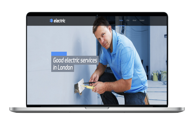
Electrician Divi Website Design
The cost to build and host this Electrician Divi Website Design just £10 per month with unlimited pages. The only other cost is the one time £50 setup fee. There are no any other costs or any hidden charges involved and you only start paying if you are happy with the website. The website will also come with its own password protected control panel so that you can edit your website at anytime and a website manager will be assigned to you in case you need any help.
There is no long term contract so you can stay with us for as long or as short as you would like
What are the most important elements of web design for electricians? Responsive design. Internet use is no longer limited to people sitting at desktop computers. Consistent layout. Content may vary from one page to another, but the basic structure of your site should be the same.
1. RESPONSIVE DESIGN
Internet use is no longer limited to people sitting at desktop computers. Devices like smartphones and tablets make it possible for users to access your site anywhere, and your website needs to look good across every one of them.
This is why responsive web design in Electrician Divi Website Design is so important. This type of design makes your website display the same across every device, and ensures that all visitors have a good user experience.
2. CONSISTENT LAYOUT
Electrician Divi Website Design content may vary from one page to another, but the basic structure of your site should be the same. Consistency makes your site easy to understand and navigate, and will help visitors find what they are looking for.
There is no formula every electrician should use for their web design, but you should include your company name, logo, and contact information on every page. This makes it possible for users to contact you no matter where they are on your site.
3. SIMPLE NAVIGATION
Users shouldn’t have to struggle to find a contact form or details about your services. Ideally, they should be able to find the page they want in one or two clicks.
Even if it might look cool, stay away from complex navigation systems. Simple is best when it comes to helping your visitors find their way around your site, and makes it much less likely that they will get frustrated and leave.
